
 Facebook
 Whatsapp
 LinkedIn
 Pinterest
Top 11 tips to strategize your eCommerce checkout process
The crucial part of your online shopping experience is the checkout flow as it has been the focus of attention for almost all the eCommerce stores.
Instead of paying attention to the checkout flow, people often get deeply engrossed with the design of the shop, relevant and attractive images, great user interface, and promotions though these are not less important. But the checkout process goes completely avoided and ignored.
The checkout flow becomes the only source to turn shoppers into buyers, leaving a huge impact on your revenue.
So the question that often revolves around is how to design such a smooth checkout flow to squeeze in more sales?
The article provides some brilliant tricks and tips to design your checkout process that has a prime focus on driving sales.
Why the checkout process is primarily focused?
Efforts pay a fruitful result if they are put in the right direction. eCommerce is booming each day proving the potential an online business if done correctly.
Don’t you believe this?
Amazon has reached an astonishing milestone of becoming a trillion-dollar company in 2018 one month after Apple crossed the $1 Trillion thresholds in August. This milestone was achieved by incredibly closing the deals.
The reason to brainstorm through these stats is to show how important is the checkout process for an eCommerce store to drive sales. As the checkout process can make your deal sail through, it is the cause of losing most of the sales as well.
The average documented cart abandonment rate is 69.57%.
Another study by Baymard Institute listed some reasons for shopping cart abandonment at the checkout. The graph is shown below:

With great effort and loads of tricks, you attract visitors to your online store. Did you make them turn into shoppers from ‘simply browsing’ just to abandon the carts at the last moment?
The graph above alarms you to keep checkout at the highest priority and optimize your check out process as this is causing loss at the end of the buying process.
Let us dive in and follow these tips and tricks for increasing the revenue as soon as possible!
The blog would cover the following eCommerce checkout steps:
- A visual treat for the Shoppers
- Don’t scare them with hidden shipping costs
- Prepare your Cart for Mobile-first conversions
- Feed them with multiple payment options
- Assurance through the trust symbols
- Don’t mandate for account creation
- Think about Upselling
- Do think about the exit intent
- Let them check out in their time
- Emails and Remarketing
- Speed-up the process
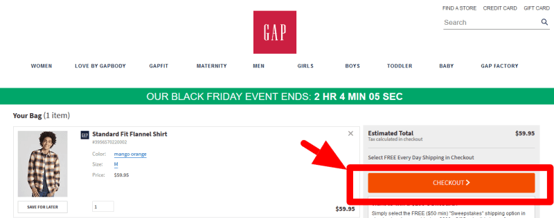
A visual treat for the users
How do you feel if someone explains how they have reached your address in turn to your question “Was it difficult to reach here?”
A similar experience a customer might have when he goes through an unnecessary, cluttered, slow checkout process. This will create confusion which is not at all suitable at that point of sale as it may result in cart abandonment.
Tips:
Always try to avoid:
- ‘Continue Shopping’ button
- Navigate buttons that direct the users to other areas
- Social media buttons
An ideal checkout layout is uncluttered, snappy, and clean like:

Another important element on the checkout page is the call-to-action button and that should leap out. This button pushes your visitor near to the final purchase every time the user clicks on the button.
Tips:
You can make them stand out by:
- Unique color, contrasting the background.
- Simple, unambiguous, intent focused button.
Don’t scare them with hidden shipping cost
What are your thoughts on witnessing questions that were out of the syllabus? Awful, isn’t it?
How do you expect your visitors to be happy when they come across additional costs like taxes and shipping while checking out?
This is one of the most popular reasons for cart abandonment.
Every shopper loves free shipping. Bingo! You just got the trick to skyrocket your sales.
But, wait a minute!
Does your business model lack support for this method? No problem. Adopt the principle of transparency. Your e-store should be able to clear the pricing to its customers.
But, if your business model supports this free shipping method, every shopping page should include details about free shipping and low delivery costs and returns.

Prepare your cart for mobile-first conversions

The mobile-first approach always has its own importance as it is one of the popular methods to drive sales. A report by Statista shows that mobile eCommerce is forecasted to contribute approximately 432.24 billion dollars of revenue to the eCommerce industry by 2022 in the United States.
Tips:
The following designing tips may help for optimizing your checkout page:
- Easy form filling
- Easily clickable buttons
- Step-by-step checkout process
- The feature ‘Save information for later’ should be present
- Uncluttered look
Thanks to technology, shopping through mobile devices have become more convenient. Phones are always within their arm’s reach and therefore there are more than 80% of chances that they would check your website from their mobile phone. If your website isn’t catering to the requirements of having a mobile-first approach and is not optimized as per that, you are actually narrowing the chances of generating conversions.
The focus on designing the mobile site should be minute and highly focused as it can result in higher bounce rates if they find it sluggish and visually disastrous. But visitors come back repeatedly to mobile-friendly websites and that accounts for nearly 74% of revisits.
When we talk about mobile-friendliness, many a time their mobile storefronts are different from their desktop versions. A significant alignment between the two storefronts as it might confuse the shoppers that they have landed in the wrong place. This further results in a bounce.
As the desktop sites include reviews that help in making decisions, your mobile store should also have the same feel and look.
Another element in mobile-friendliness is the checkout speed. Every shopper is eager to shop as fast as possible. They are in extreme need of instant gratification.
Slow site speed will make your customers abandon your site and check some other competitors’ sites as the need to get the product doesn’t fade away. Browsing behavior is another element that needs consideration. Let us have a look at some of the ways to make it optimize catering to the users’ intent.
- The key elements should be within their reach i.e., easy for the thumb for movement.
- Easy-to-click buttons should be bigger and wider.
- Larger font size to attain accuracy of text input.
- Should be able to detect and correct errors.
- Create a separate app for the checkout process for minimizing friction.
- Save the data entered by the customer so that in their next visit they don’t need to retype.
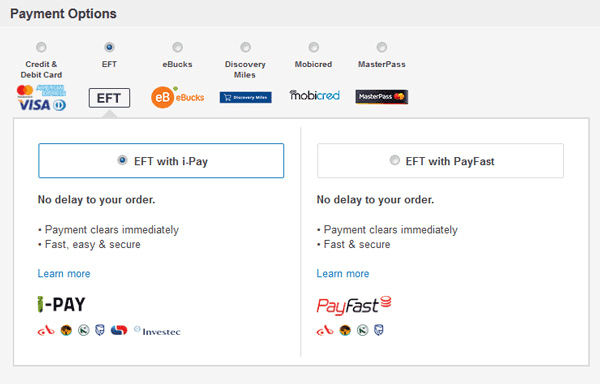
Feed them with multiple payment options
As shown in the graph earlier, 6% of customers drop the idea to complete their checkout process as the website fails to present multiple payment options. A limited list of payment options is never suitable when you are into eCommerce as you never know what kind of payment checkouts your customers prefer. Another problem arises when there is a declined credit card. 4% of customers couldn’t complete their checkout process due to declined credit card thus forcing them to abandon your eCommerce checkout process.
Tip:
Add several payment options for your online shop. Try to have the popular payment options integration:
- PayPal
- COD
- Credit/Debit cards
- Mobile Wallets, etc.
Assurance through the trust symbols

Imagine yourself in the shoes of the customer. You have added all the items in the cart and you are proceeding towards the checkout.
Would you have a blind trust in the website for sharing your credit/debit card credentials?
Are you brave enough to complete your checkout process without getting assured about the information you are sharing?
If you aren’t sure and not convinced enough, you will simply abandon the cart and leave the website. Thus, trust is a huge factor that will convince your customers to make a decision to purchase from your eCommerce store.
Including trustmarks is a good move. You can add these trust symbols to make your customers assured with their decision to buy from you.
Tip:
You should have:
- Reviews by the merchant as per the orders. Example: 4.2/5 based on 2000 orders
- SSL certificate.
- Third-party security validation like McAfee, etc.
- Clear customer service/help centers, return policies, and T&C links.
- Logos of all the payment options that you are providing and payment certification. Example: Verified by Visa
- Any kind of business accreditation.
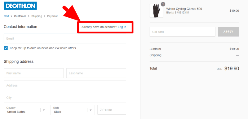
Don’t mandate for account creation
Irritating users with account creation pop-up or forms will make them abandon the carts at an early stage. Christian Holst, Baymard Institute founder brought to the notice that 30% of users abandon their cart if the website prompts to ask to register upfront way back in 2011.
Tip:
Keep an option ‘Continue as guest’ and later after completing their process, ask them to create an account with you. This will help you to boost conversion.
Think about upselling

Upselling is the process of encouraging customers to buy a higher-end product of the item they have chosen. Upselling is a process where you give more options to your customers to buy products. Doing in-cart upsell is always recommended as it is more effective. In-cart upsell provides with the following options:
- A section named as ‘Related Product Section’
- When the customer is placing an order in the online store, you can offer an upsell.
These tips improve store conversions and customer loyalty.
Do think about the exit intent
Are your customers ready to leave the website before completing the checkout process?
You know your customers are departing. How about trying the last effort before they leave? Preempting their departure with some offers like the one shown below can be thought of.

Such exit intent pop-ups are activated when the user clicks on the back button or the exit cross on the browser or tab interrupting the normal pattern of the user. The user has to make a decision in order to get back to their original state.
You can offer some discount or cashback so that they may change their minds and make a purchase.
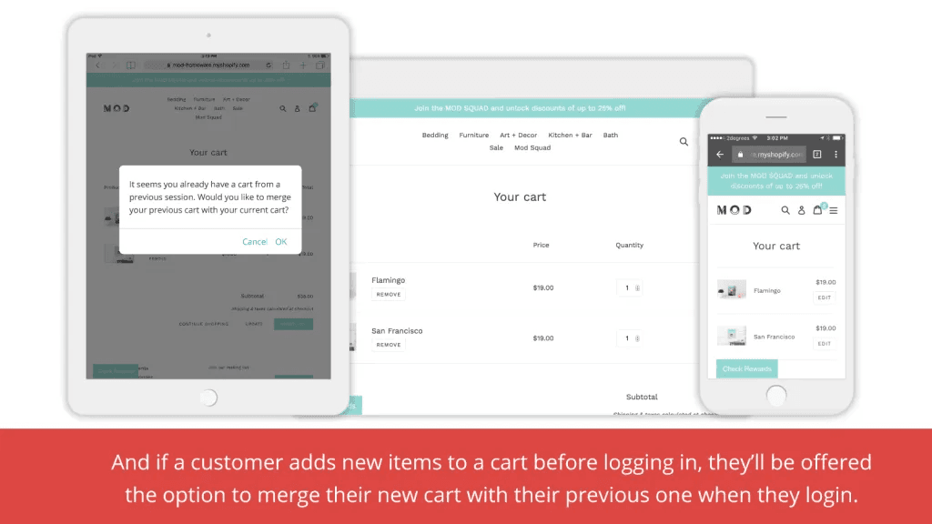
Let them checkout in their time
How much can you convince your customers?
Even though you feel you have succeeded, will you guarantee a 100% conversion?
Customers have a number of reasons to complete the checkout process later with the expectation that their cart remains the same way they had left irrespective of the device.
Tip:
With ‘Persistent Cart’ functionality you can allow the customers to pick up the transaction where they had left.
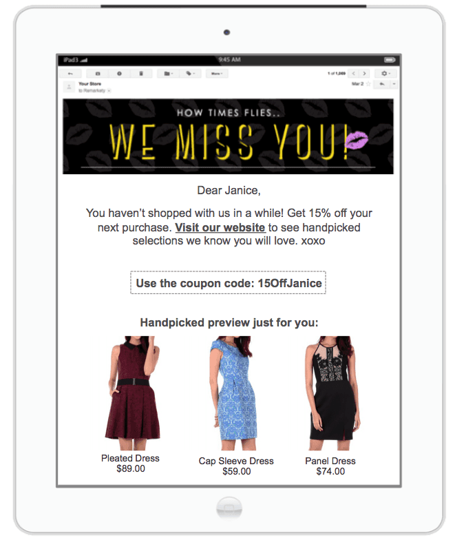
Emails and Remarketing
After multiple efforts and strategies, your customers are still leaving their checkout process incomplete. What do you plan to do with them?
No! You just can’t simply give up on them. You are here for business.
Follow these tips:
You can use cart abandonment email auto-responders for bringing the visitors who have abandoned your carts. Remember, the desire of buying things never fade away. All you have to do is know their exact pain point and send emails hitting those areas correctly. You can use MailChimp.
You can offer heavy discounts and lure them with coupons, cashback, and other promo codes to get them back. You can entice them through ads on social media.
Speed up the process
A complicated checkout process will scare away the customers. Therefore, keeping a simple checkout process can easily increase your sales.
Tips:
You can follow the tips below:
- Address look-up service for automatic Zip Codes and addresses.
- Autofill form data
- Save login credentials.
- If a match is found between the billing and shipping, the website will copy automatically.
- The requirement for a password should be simple.
Wrapping it up!
These actionable tips and tactics are definitely going to provide visible improvements to you for your online store.
But, it is worth letting you know that there is no solution to have an optimum checkout process. On the basis of the demographics, pricing, complexity of the product, and other variables, the results will differ. But this is a guarantee if you could always research the best possible option for your online store with regular monitoring and improvement.
Since driving sales isn’t rocket science and always depends on the trial and error method, you should always be open to learning new methodologies to optimize your store catering to the requirements of your customers.
Author Bio


Related Blog


 Start Chat